Relevant information about this
upper-air page
Winds/Temperatures on pressure levels
Every day at 0000 and 1200 UTC, weather stations around the world launch helium-filled
balloons with miniature weather instruments inside a package the size of a milk carton.
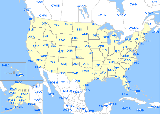
These are called radiosondes or rawinsondes and are launched at the sites shown on the
map found on the Upper-Air data
page (as well as from other sites around the world not displayed on the map). These
balloons carry sensors for measuring temperature, pressure and humidity (moisture).
The measured data are relayed via radio signals and received by the ground station where
winds are computed based on these signals or by newer GPS technologies. From these data
meteorologists obtain "soundings" or profiles of temperature, moisture, and winds
with altitude.
The graphics shown on the top of the Upper-Air data page plot these data on a map
of North America with temperature (°C) to the upper left, dewpoint depression (°C)
below it, altitude of the pressure level (decameters) to the upper right, and a wind
barb representing the wind speed and direction. These data are fed into supercomputers at
the National Centers for Environmental Prediction which analyze the data into a regular grid
of data before predicting weather into the future. The contours of temperature and heights
are provided by one of these numerical models, called the Weather Research and Forecasting model (WRF) Rapid Refresh (RAP).
|
Skew-T/Log-P Diagrams
The next section of the Upper-Air page provides the rawinsonde
data on a diagram meteorologists call "Skew-T/Log-P" plots. This name comes
from plotting Pressure in a logarithmic scale on the Y-axis and Temperature as skewed
lines on the X-axis (running from lower left to upper right). The diagram is truly a
tool for meteorologists and can reveal many key aspects of the atmosphere above a single point
on earth - it is most often used to judge the amount of instability or thunderstorm
potential. For simplicity, many of the severe weather indices are pre-computed and placed
along the top of the graphic (Lifted Index, Sweat, CAPE, and many others). The Skew-T
plots themselves are generated using the
SHARPpy visualization package, an open-source plotting engine based on the National
Oceanic and Atmospheric Administration/Storm Prediction Center's (NOAA/SPC) in-house
Sounding and Hodograph Analysis and Research Program (SHARP) package.
A good online guide for how to interpret a Skew-T plot can be found on
the Univ of Illinois' Weather
World 2010 website.
|
|
|

